2023 - 2024
Tradebeyond Design System 1.0
Establish the foundation of a Saas Design System
- Google Material 3
- Atomic Principle
- Design Tokens
Background
Low design efficiency due to poor design system
When I joined Tradebeyond, I notice the legacy "design system" is poorly maintain and is basically unusable. This situation not only slow down design process since there is no system to follow, it also create a inconsistent experience between different product. As a result, I took the initiative to establish a design system for Tradebeyond.
Chanllenges
Design components is fragmented with no foundation and documentation to follow
No centralised component library
Designers create their own components in separate files, a vicious cycle that makes the library more and more fragmented.
No foundation to follow
There was no success color token to reach for, so every product invented its own colors.
Lacking documentation
Without guidelines, there was no shared source of truth for how components should be used.
The Atomic Design
Building design system with atomic design principles
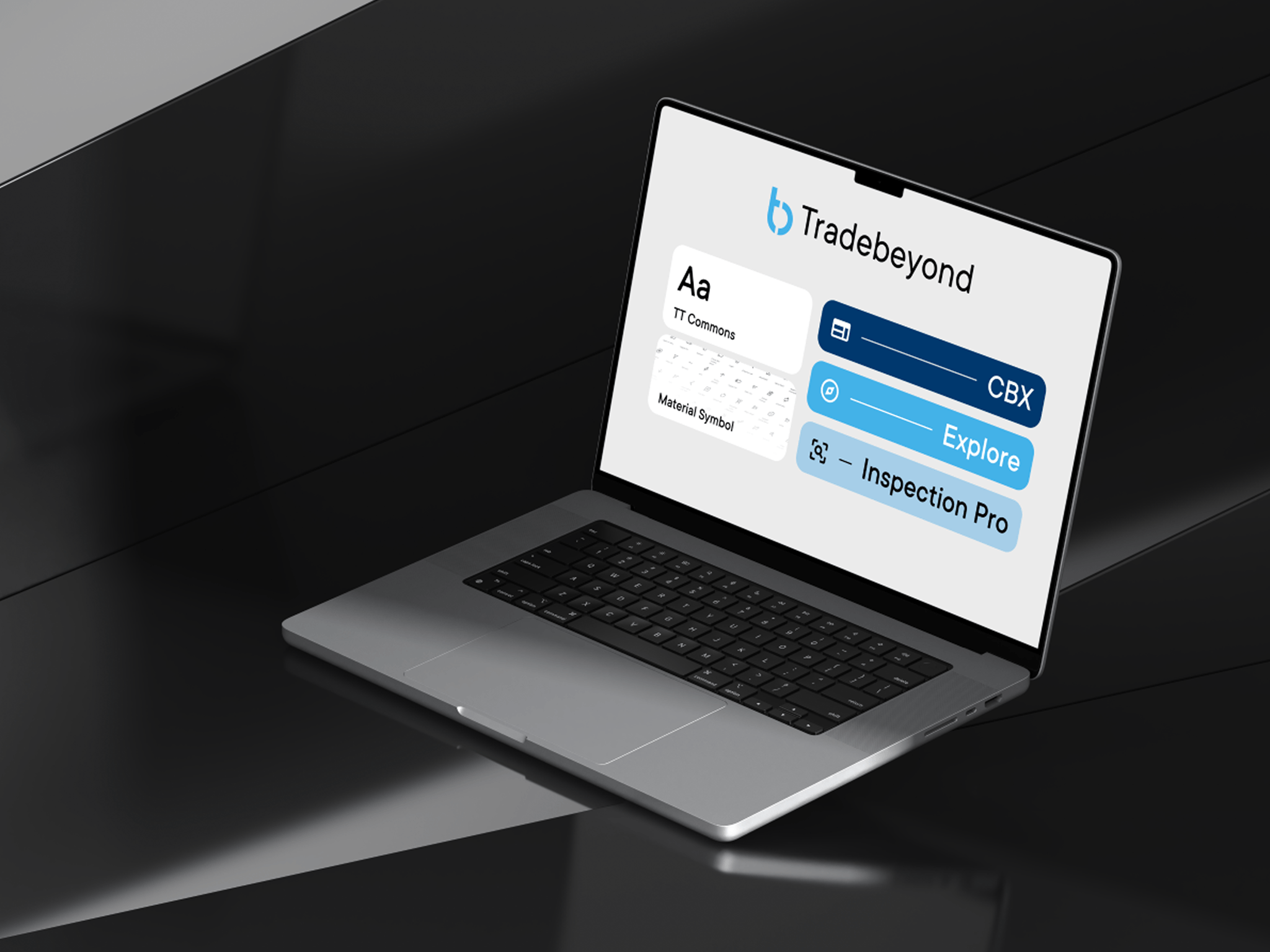
To solve these problems, I took ideas from the famous atomic design and applied to Tradebeyond's products, with the inspection app - Inspection Pro being the primary example. Click here to learn more about "Inspection Pro" first.
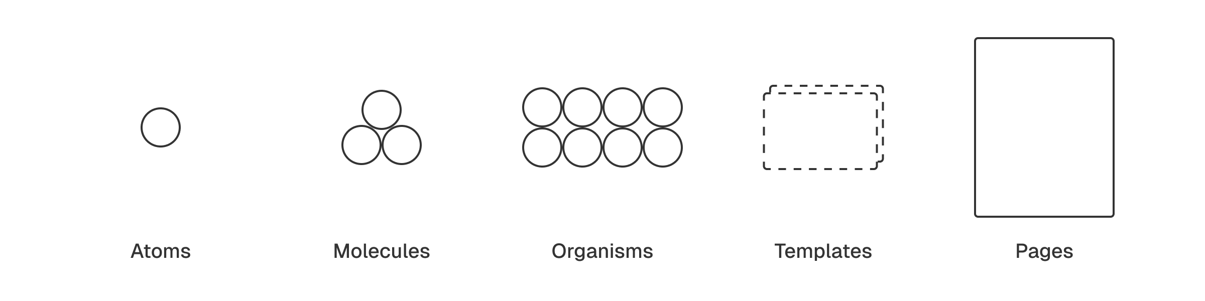
Atoms
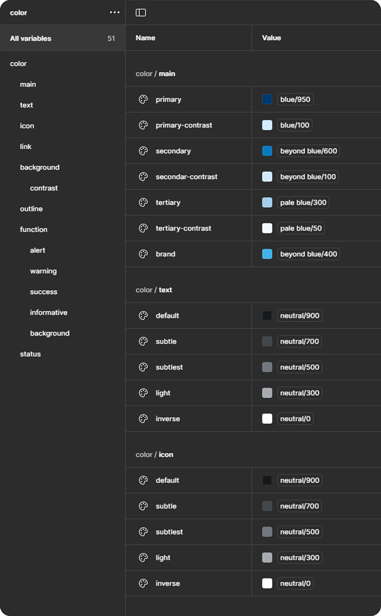
To start off, design tokens needs to be defined. This ensure every UI element uses the same set of token instead of each designer coming up with their own values. These "atoms" can range from color to radius corner, and icon to font size.
Using Figma's "variables" feature for creating and managing design tokens. I set up foundation token so designer can match them to semantic token for the UI element to use. These semantic token uses name that describe their purpose in short and clear form. Below are some color token for Web Platform.
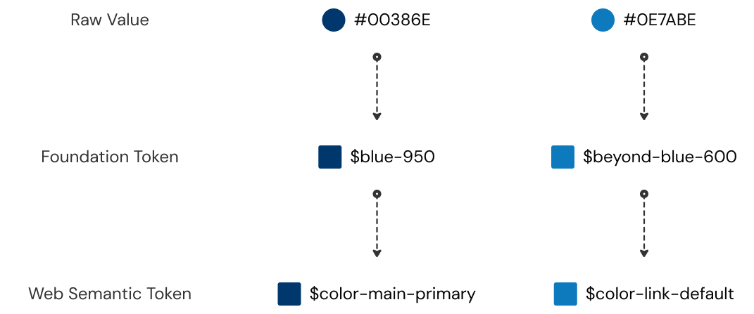
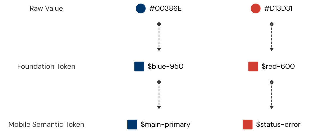
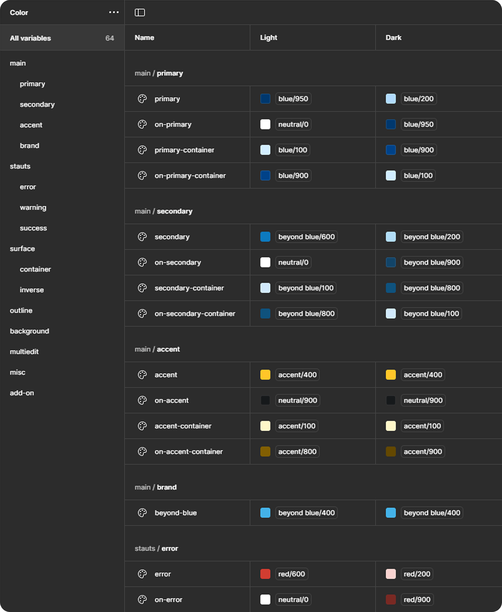
As for the Mobile App (e.g. Inspection Pro), since we are using Google's Material 3 Design System under Flutter framework. I can use the same set of foundation token but match them to Material 3 semantic token. Creating a consistent color between Web platform and Mobile product .
Molecules
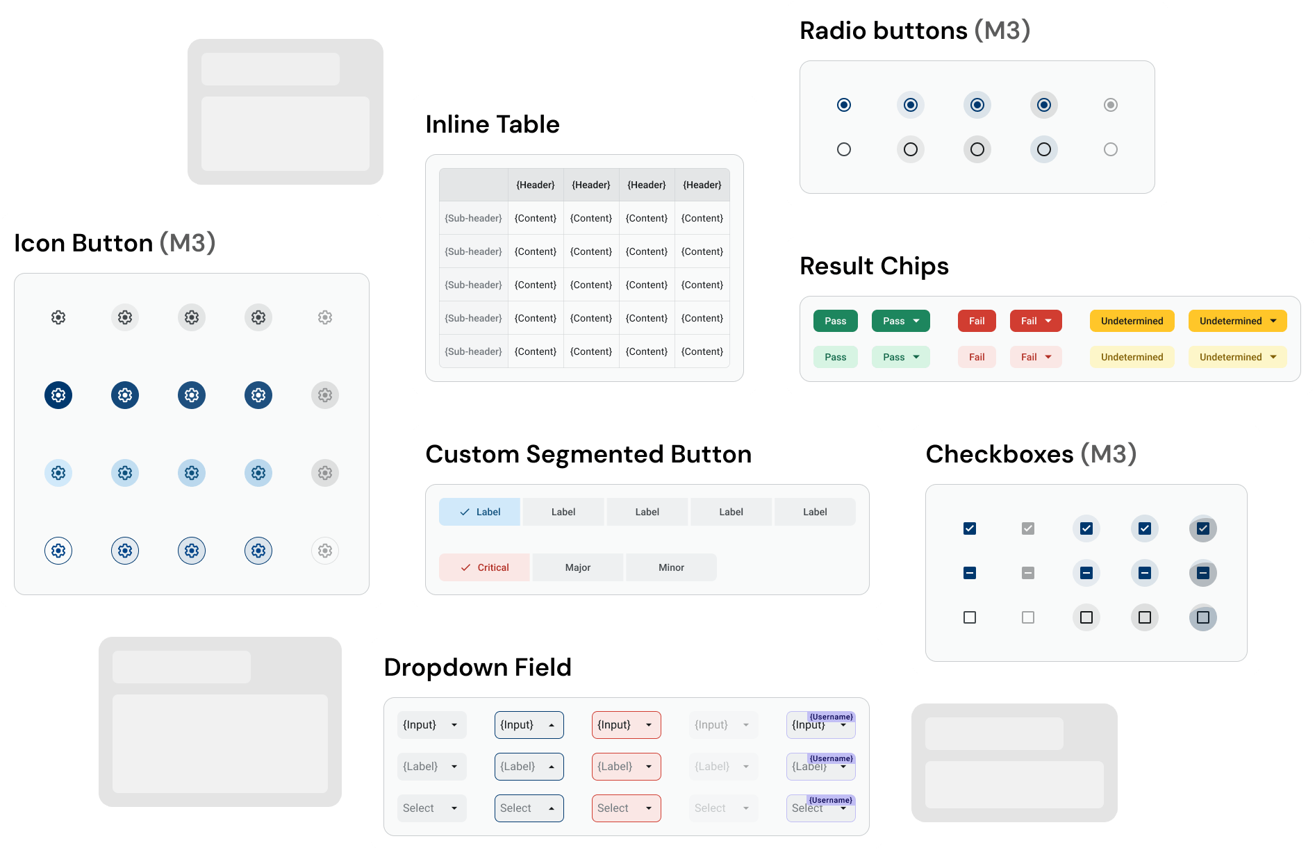
Once we have the "atoms" ready, we can create the components. In Inspection Pro, although there are already handful of components ready to use in Material 3 library, some custom components are still needed.
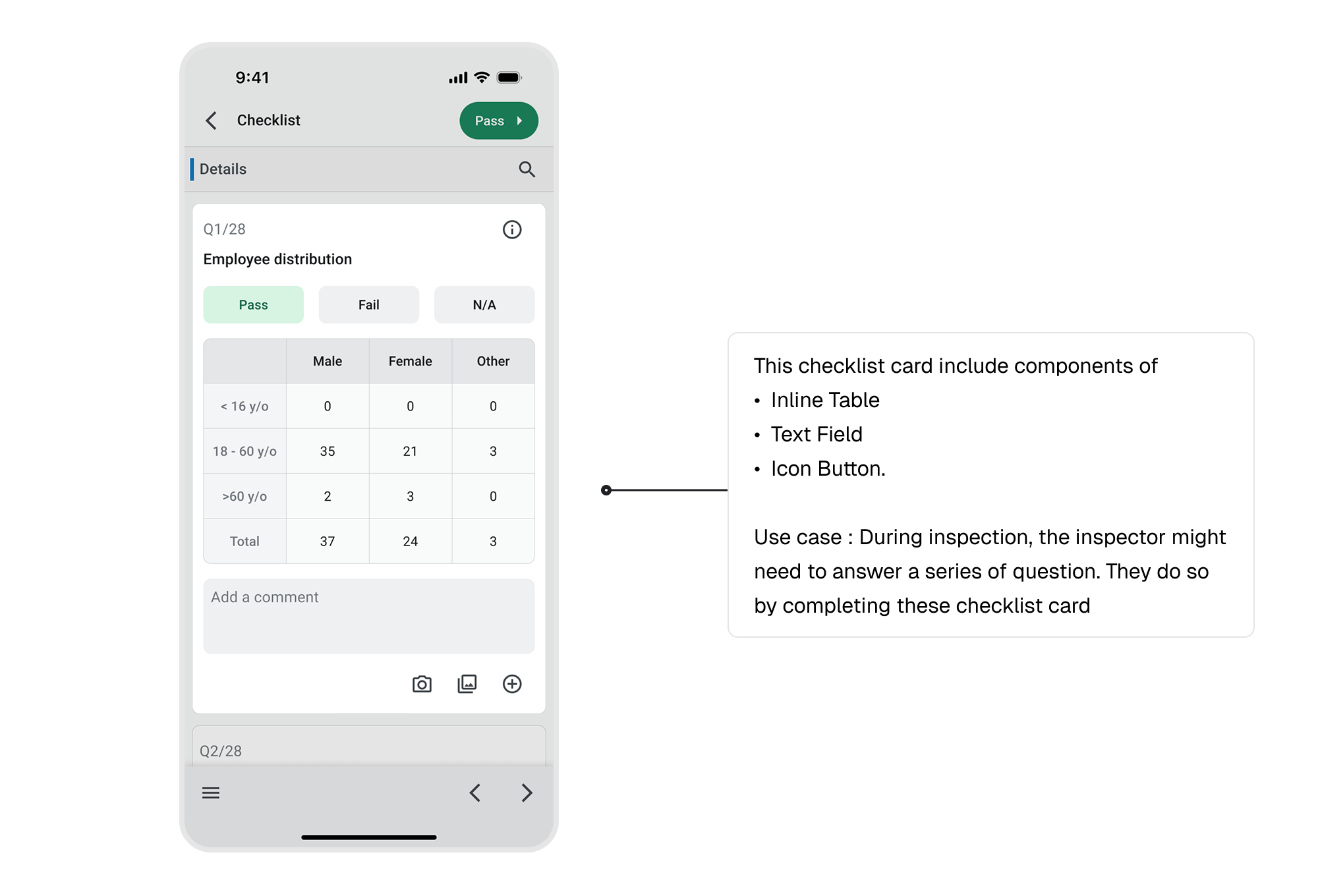
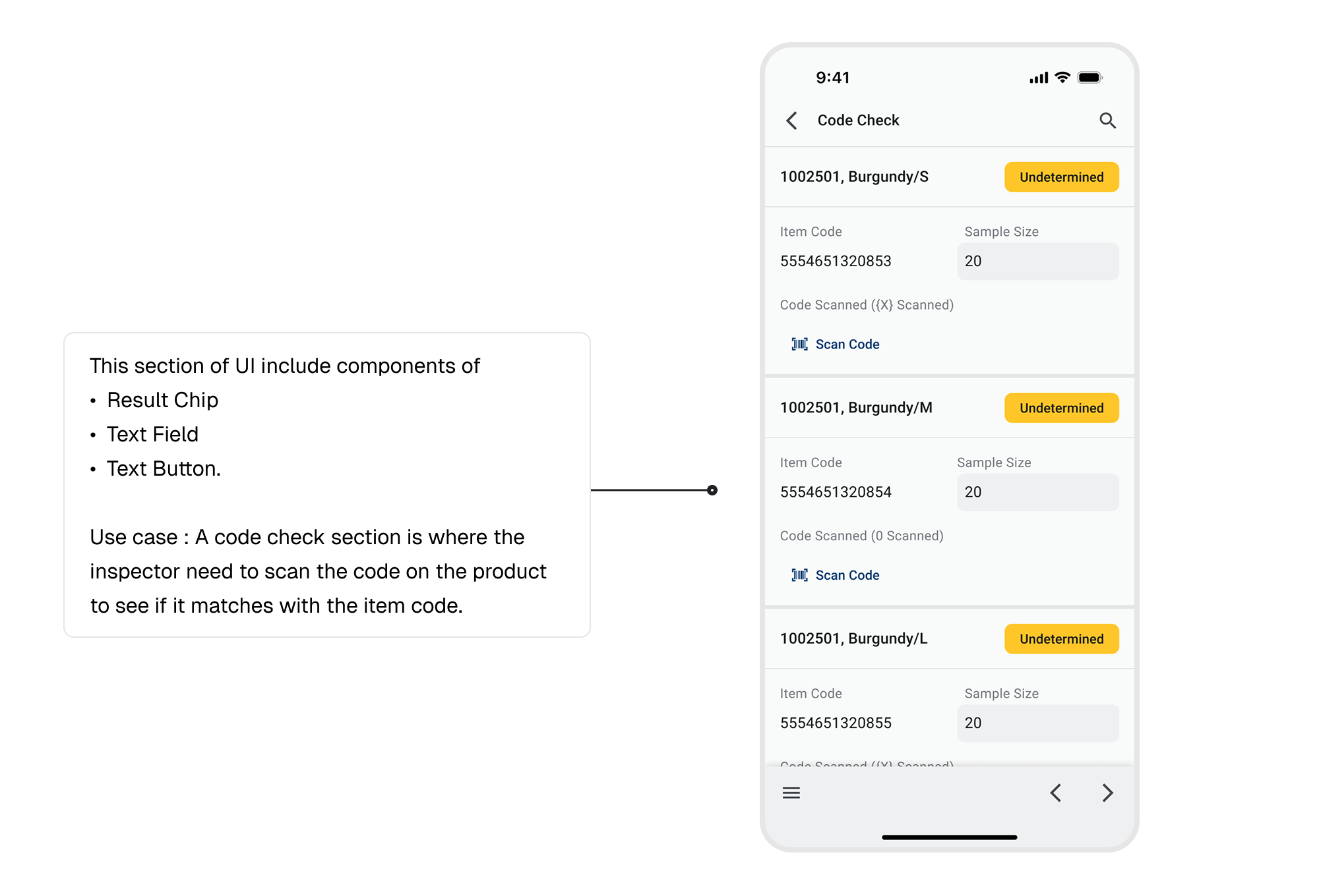
Organism
Next, multiple "molecules" combine to form "organism". In another word, larger component that are made with several smaller components.
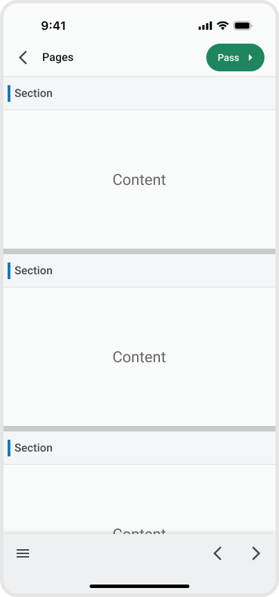
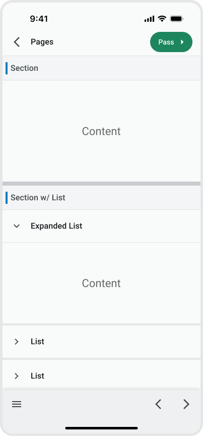
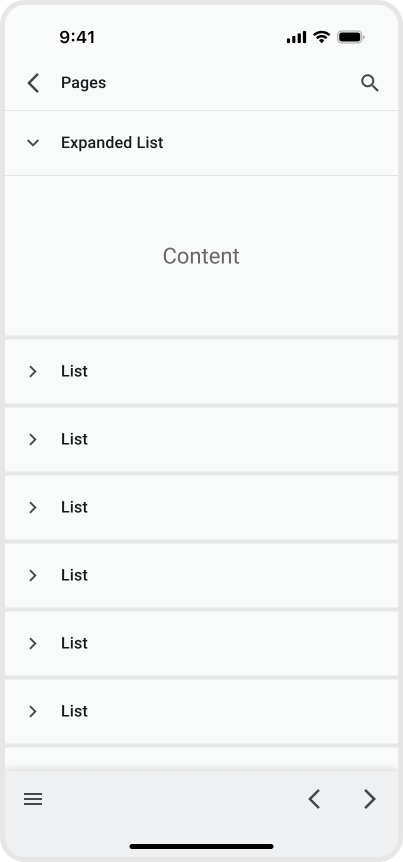
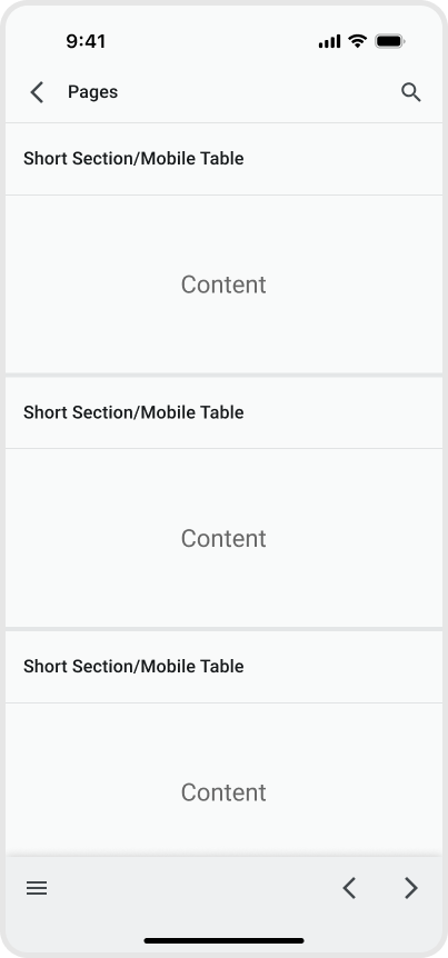
Templates
With various UI component in place, it is crucial to setup some template or pattern for these component to fit in. This can ensure a consistent UI/UX across the app. Here are the 4 main templates of Inspection Pro.
Configuration
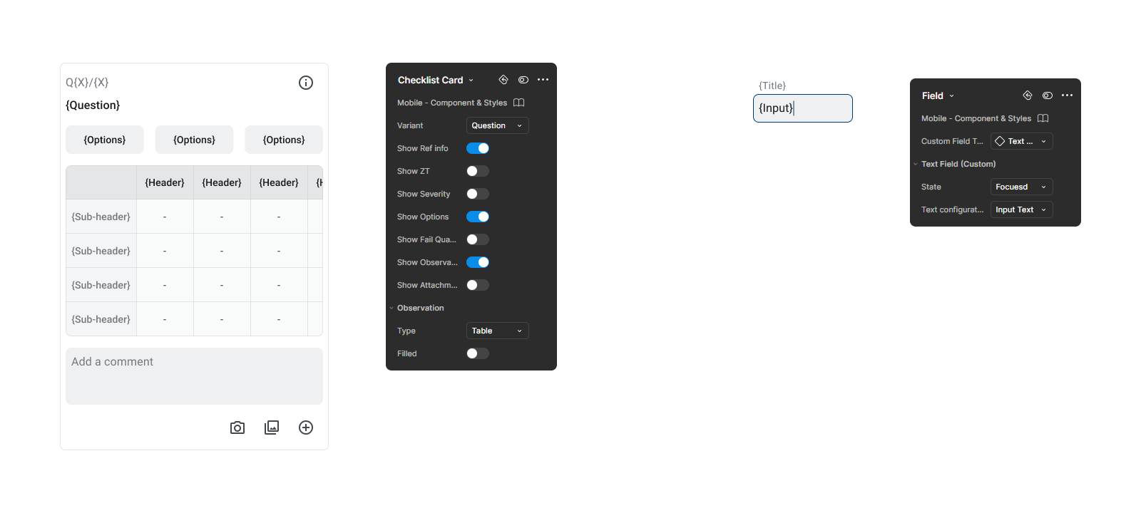
Components is built to be configurable for flexibility
Components contain different properties by using feature from Figma like "Swap Instance", "Nested Instance", "Variant" & "Boolean Properties" etc. For examples, designer can toggle different element that appears in the checklist card, or change the field to different type or state.
Accessibility
Compliant with WCAG 2.2 Standard
All UI component color contrast passes the WCAG AA standard to meet the accessibility requirement. Both normal and large text have a color contrast larger than 4.5 : 1 .

Final Result
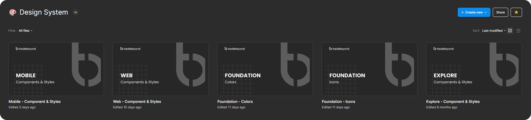
Established 2 foundation files and 3 product's components library
After months of work, I have set up a initial design system for Tradebeyond. With 2 foundation file of color and icon, where the centralise color token/palette and icon is stored. Then, products from mobile and web have their components built on the foundation. All of the components built will also be placed inside a single file for clear documentation and organisation.