2023
Revamp Reusable Tableware Web-app
Enhance the borrow/return user flow & app experience
- B2C
- Web App
- Startup
Background
Revamp the reusable tableware web app to improve usability & product experience
My main task during the internship at Recube Ltd, a reusable tableware service provider, was to revamp their current web app's UI/UX. I started off by identifying some user pain points and analysing the existing app, followed by some competitive analysis, and finally iterating the design based on feedback from the stakeholders.
Challenges
Flaws in existing user flow and app structure
Inefficient navigation and information architecture
Important pages such as "My Coupon" are hard to access, while less important pages like the wallet are put in a prominent area. Also, the home page is too blank without much content.
Troublesome borrow/return process
Restaurant staff's feedback suggests it's annoying to scan the user's QR code, especially during peak hours when staff are extremely busy
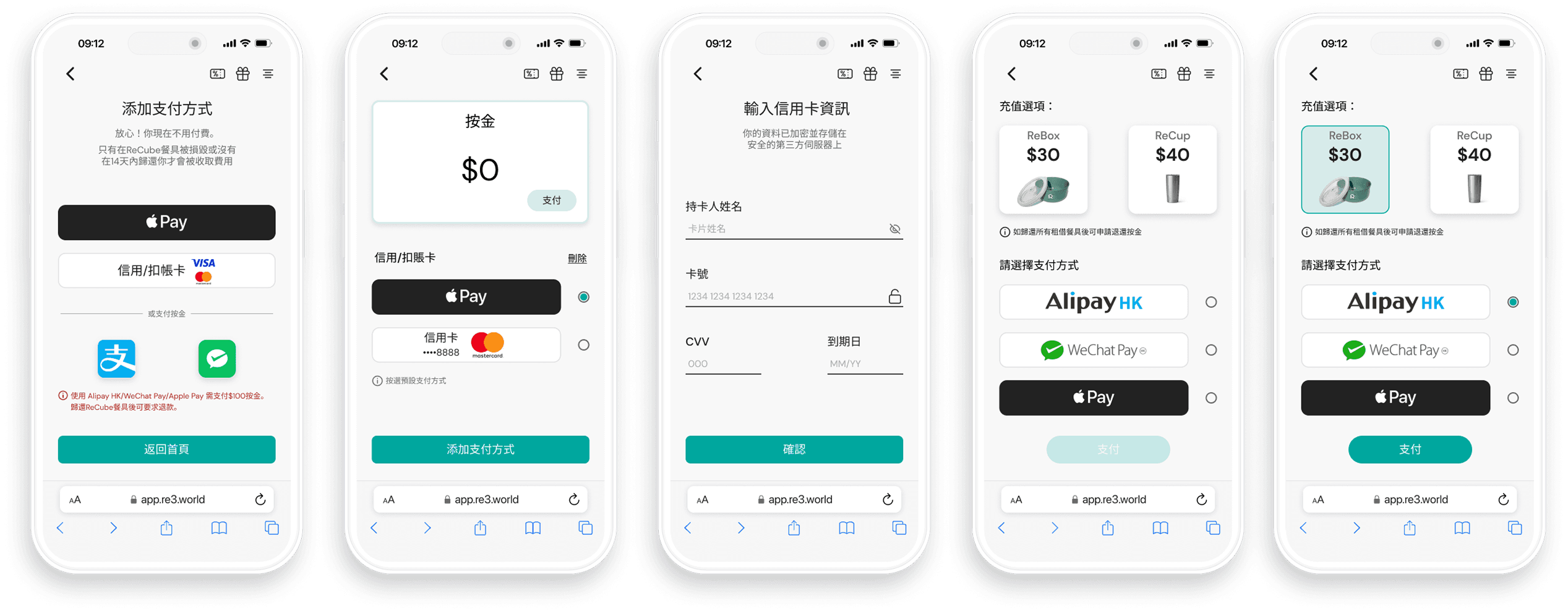
High drop-off rate during add payment
Users feel hesitant and insecure about adding a payment method, which blocks them from using the service.
Design Process
Main focus of the revamp includes updating visual language, improving IA & redesigning the borrow/return user flow
Visual Update
The first task is to set up a simple design guideline. I consolidated the colors and font system and created a library inside Figma.
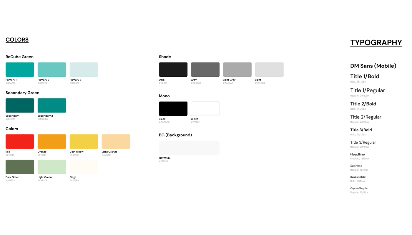
On top of that, I updated the icon set for the Recube brand and redesigned the ReCoin logo, used in the rewarding scheme.
![]()
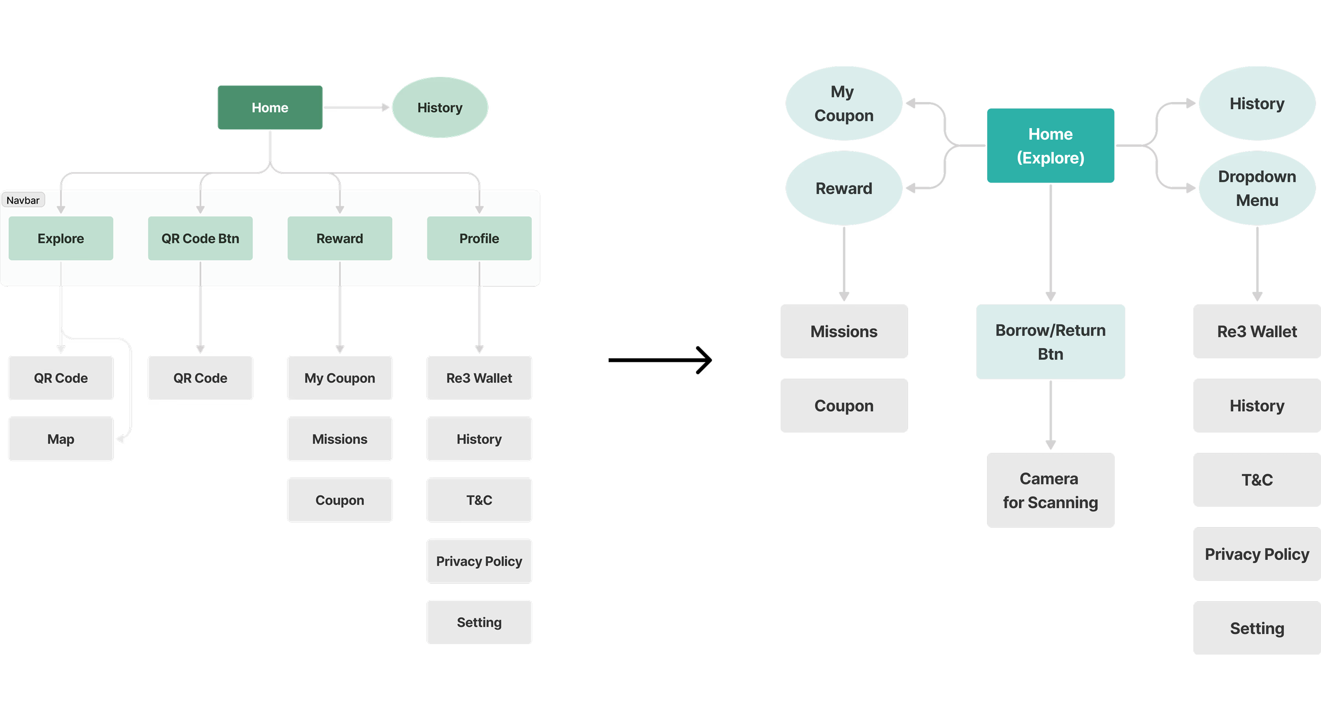
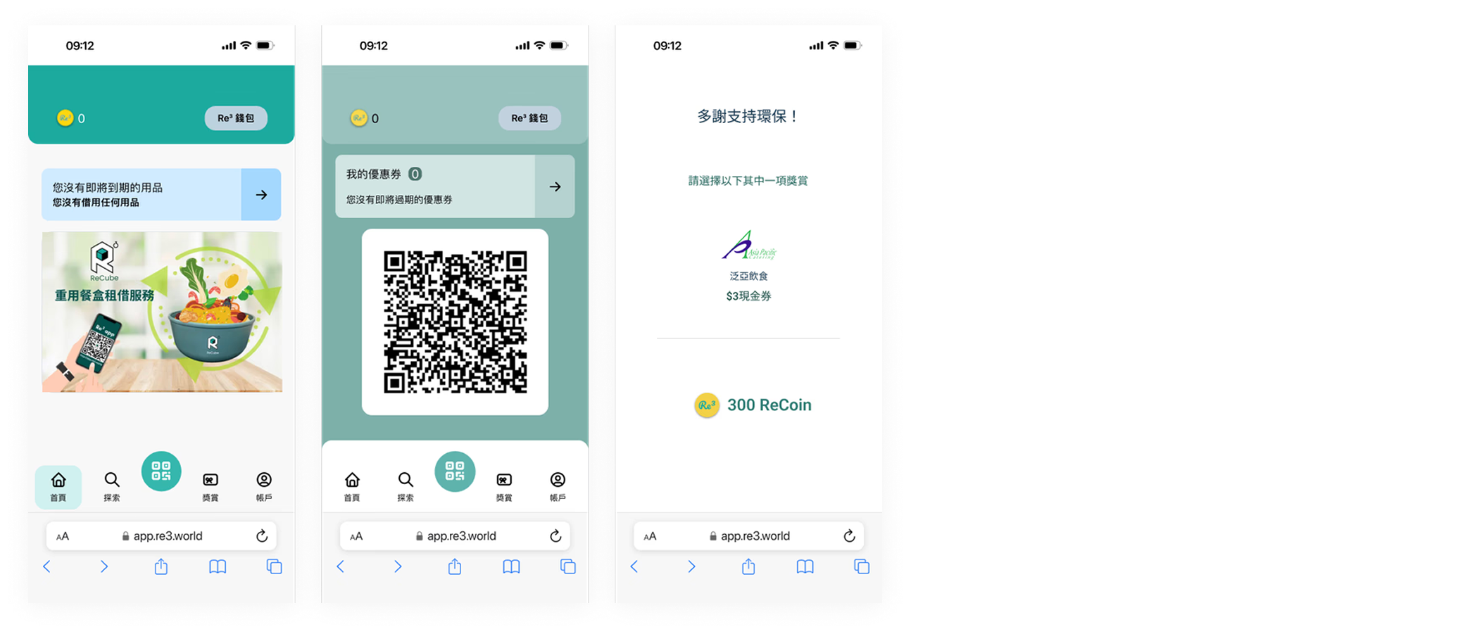
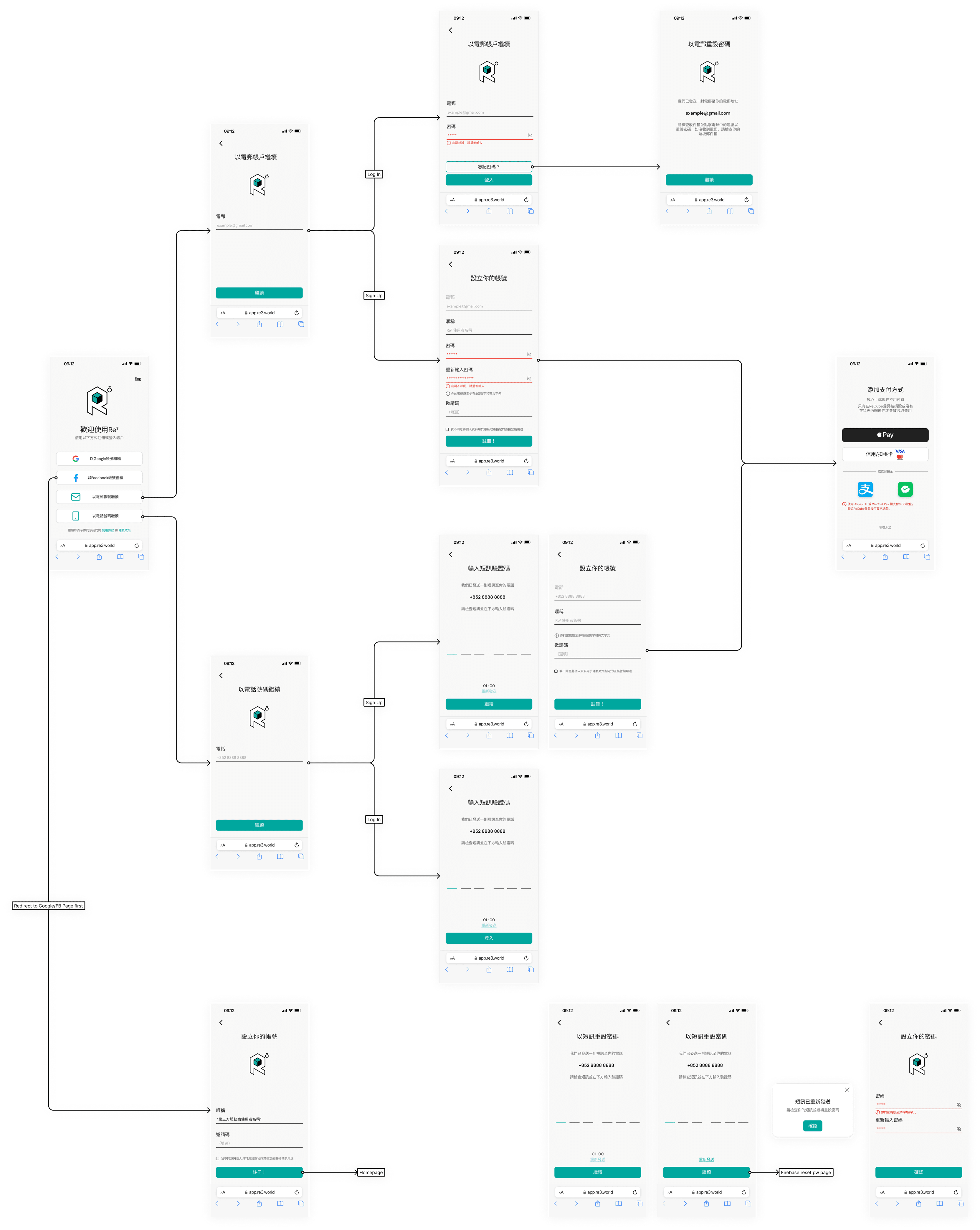
Redesigning Information Architecture
Next, to address the challenges around navigation and IA, I decided to redesign the IA in a more efficient way. Since this is a web app, a Navbar approach seems space-consuming and leaves a small viewable space for users. Therefore, as seen in the diagram below, I reassigned the navigation in a more intuitive way, where the Navbar is removed and users can now directly access features like "My Coupon", "Coupon" and "History" on the home page. Also, the borrow/return button is well labeled with text.
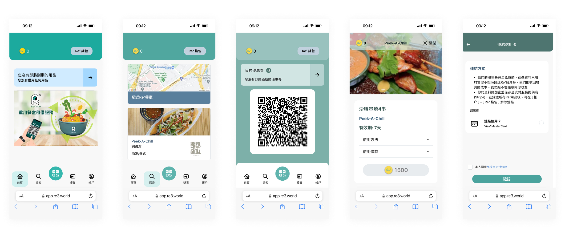
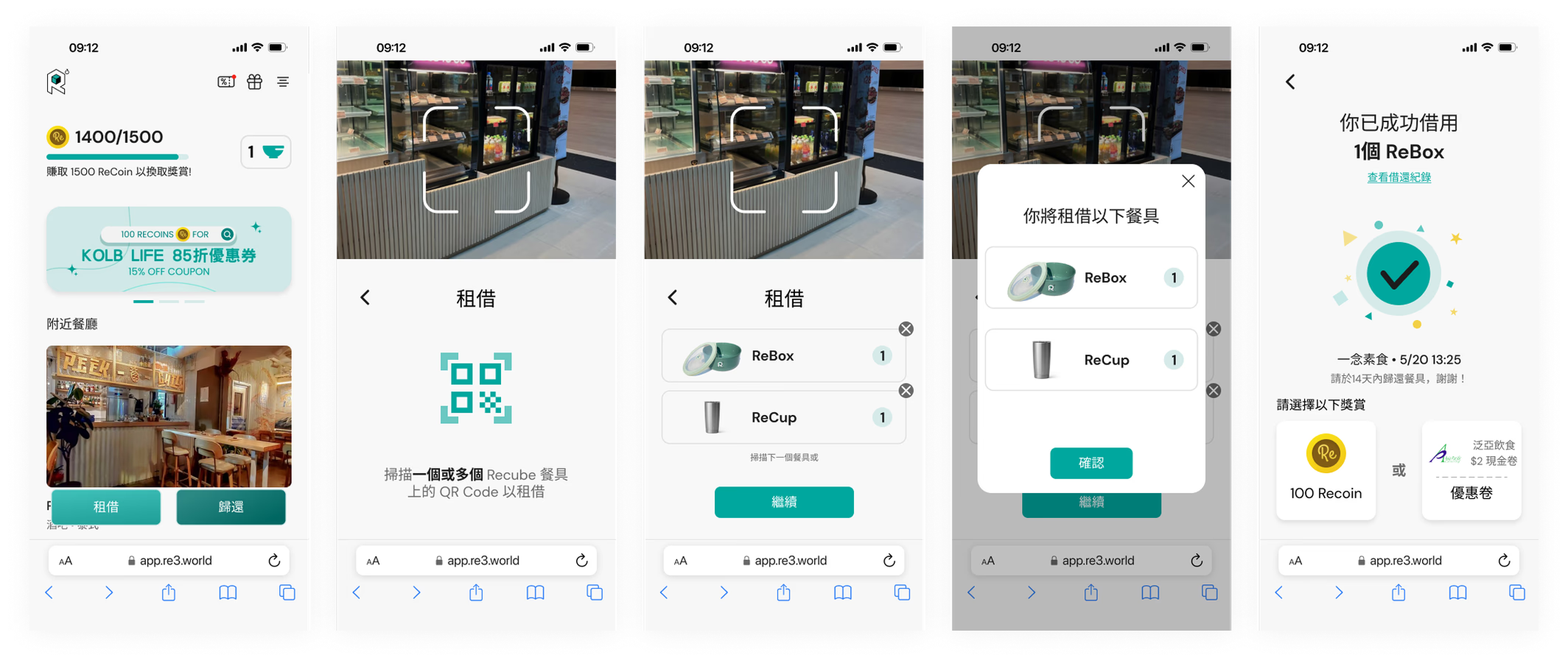
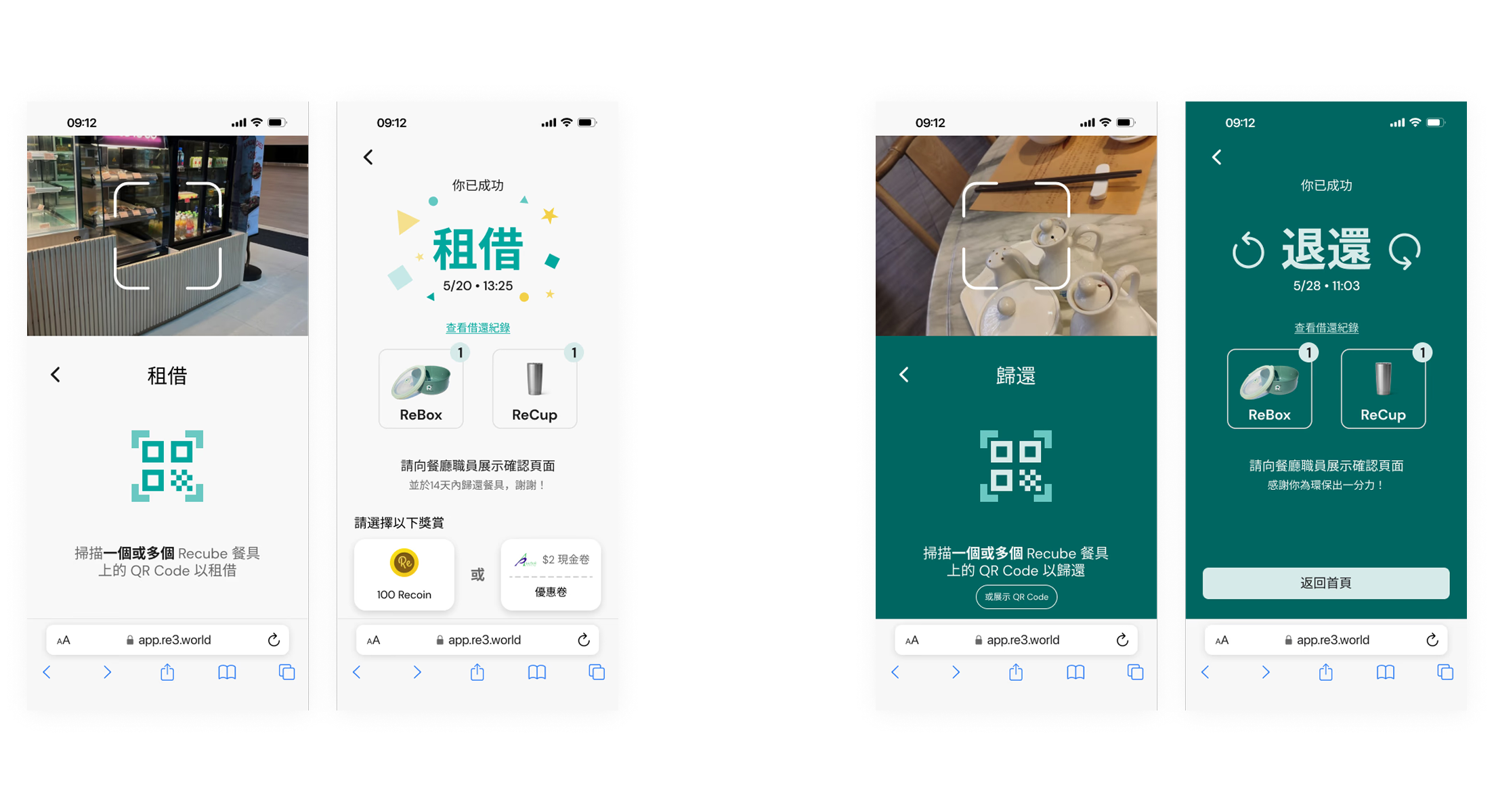
New Borrow/Return Process
In light of the restaurant's feedback that they find it troublesome to scan the user's QR code, we decided to reference our competitor's borrow/return process. The new flow becomes the user scanning the tableware to borrow/return.
As-is
New Design
Iteration
Borrow/Return screen is revised to enhance clarity
A concern was raised that the borrow and return confirmation screens seem alike, which may affect restaurant staff's ability to check whether the user had successfully completed the action. Therefore, I iterated the screen to a version where the words "BORROW" and "RETURN" are now prominently displayed to help restaurant staff identify the user's completion of the action.
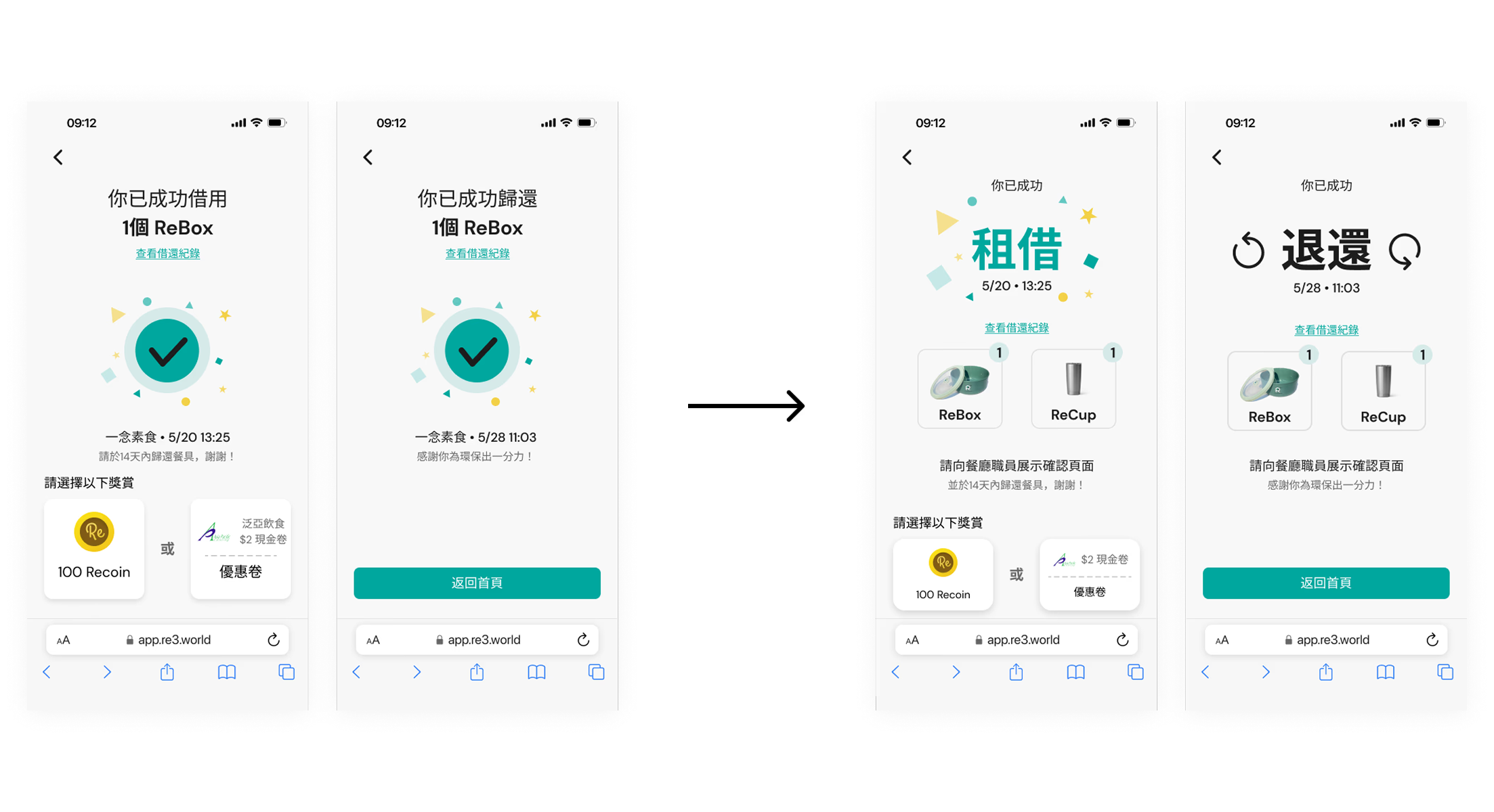
After some discussion on this iteration, considering restaurant staff may need to view the screen from a distance and might not notice the detailed wording on screen, we wanted to make things clearer between the borrow and return processes. Therefore, we changed the background colour of the two processes for the final iteration.
"BORROW" being white and "RETURN" being dark green.
Design Showcase
Design Showcase
Onboarding
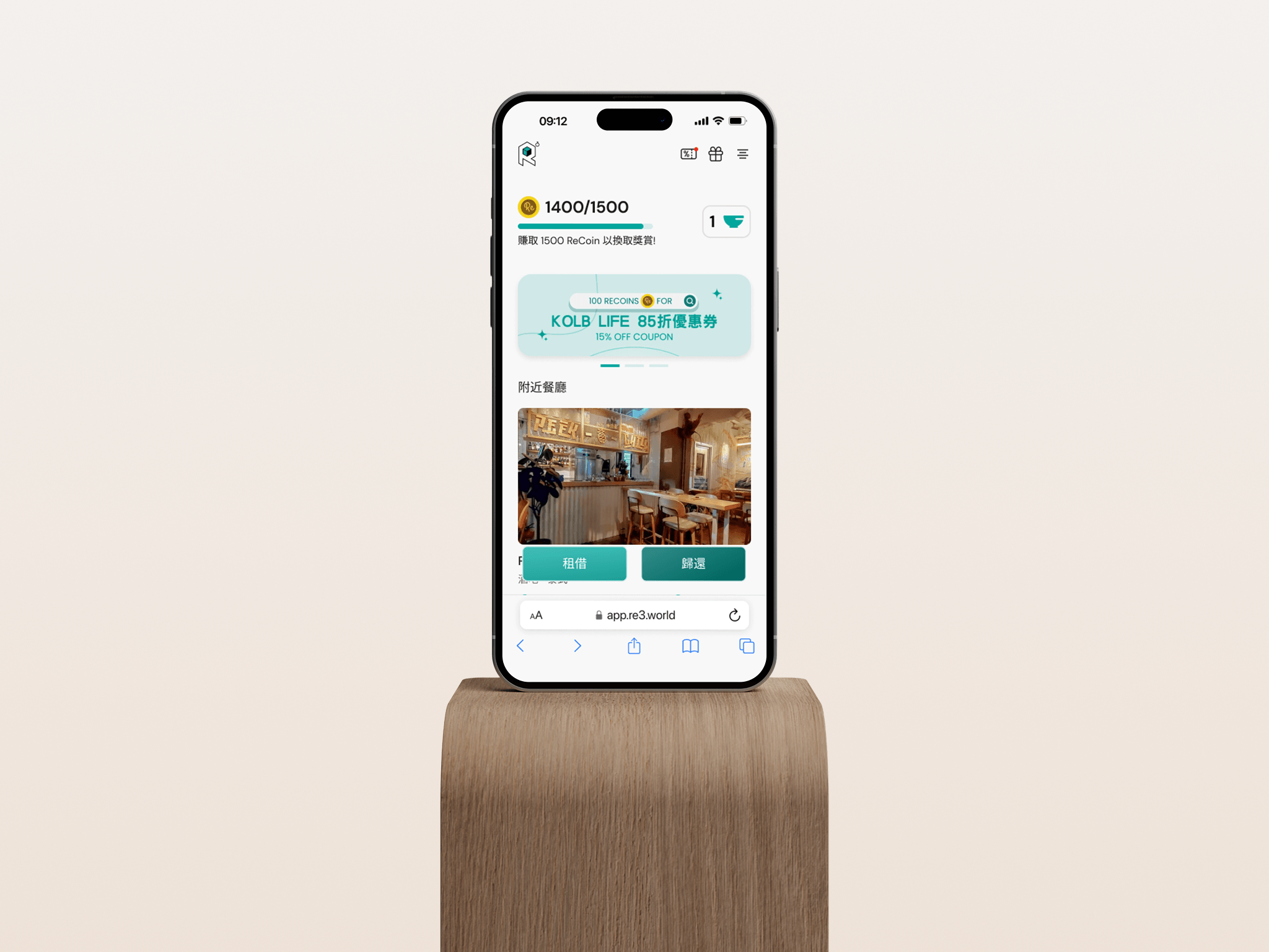
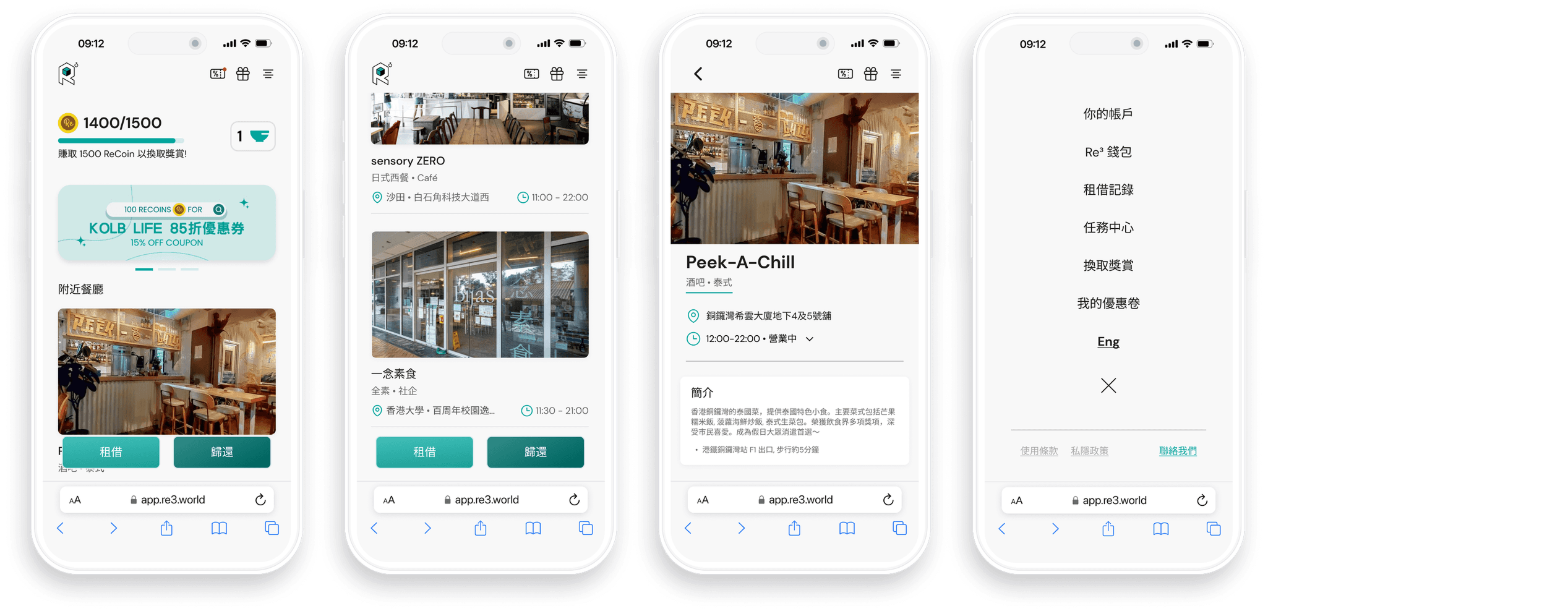
Home page
Restaurant detail and drop-down menu
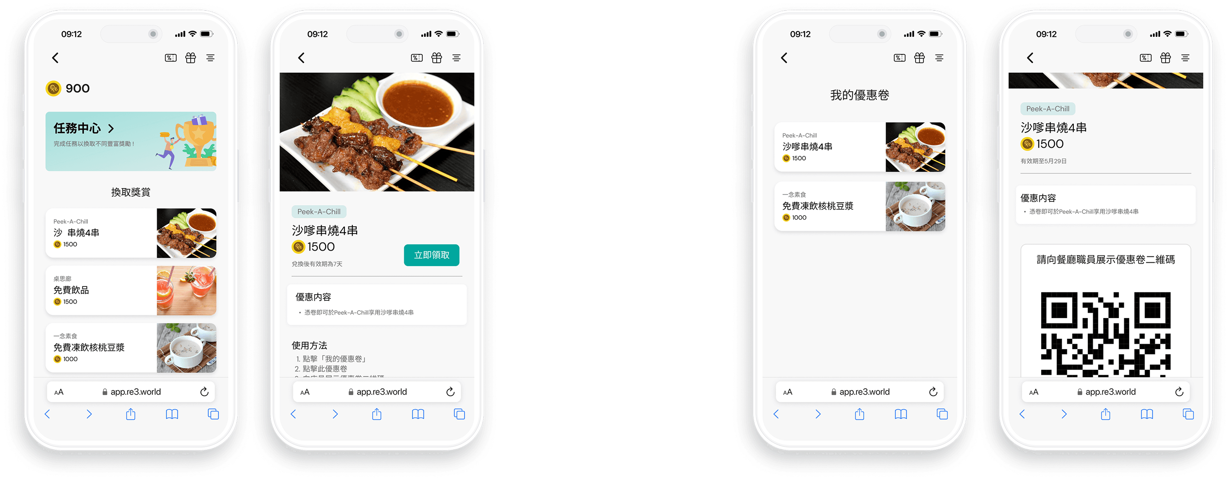
Reward Page
Place to view coupons details
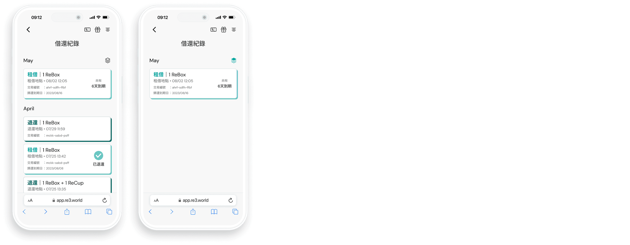
Borrow/Return History
Includes a filter button to show un-returned items
e-Wallet
Make a deposit or add credit/debit cards
What's Next?
To measure the effect of the new design, some KPI metrics can be used to validate the result.
Conversion Rate
With the new design, where users can now easily add payment through Apple Pay with a clear explanation of the operation, we can observe if there is an increased number of users who take the desired action, which is starting to use the service by adding a payment method.
Task Success Rate
This KPI metric can measure whether users successfully adopted the new user flow in the borrow/return process